

The Opportunity
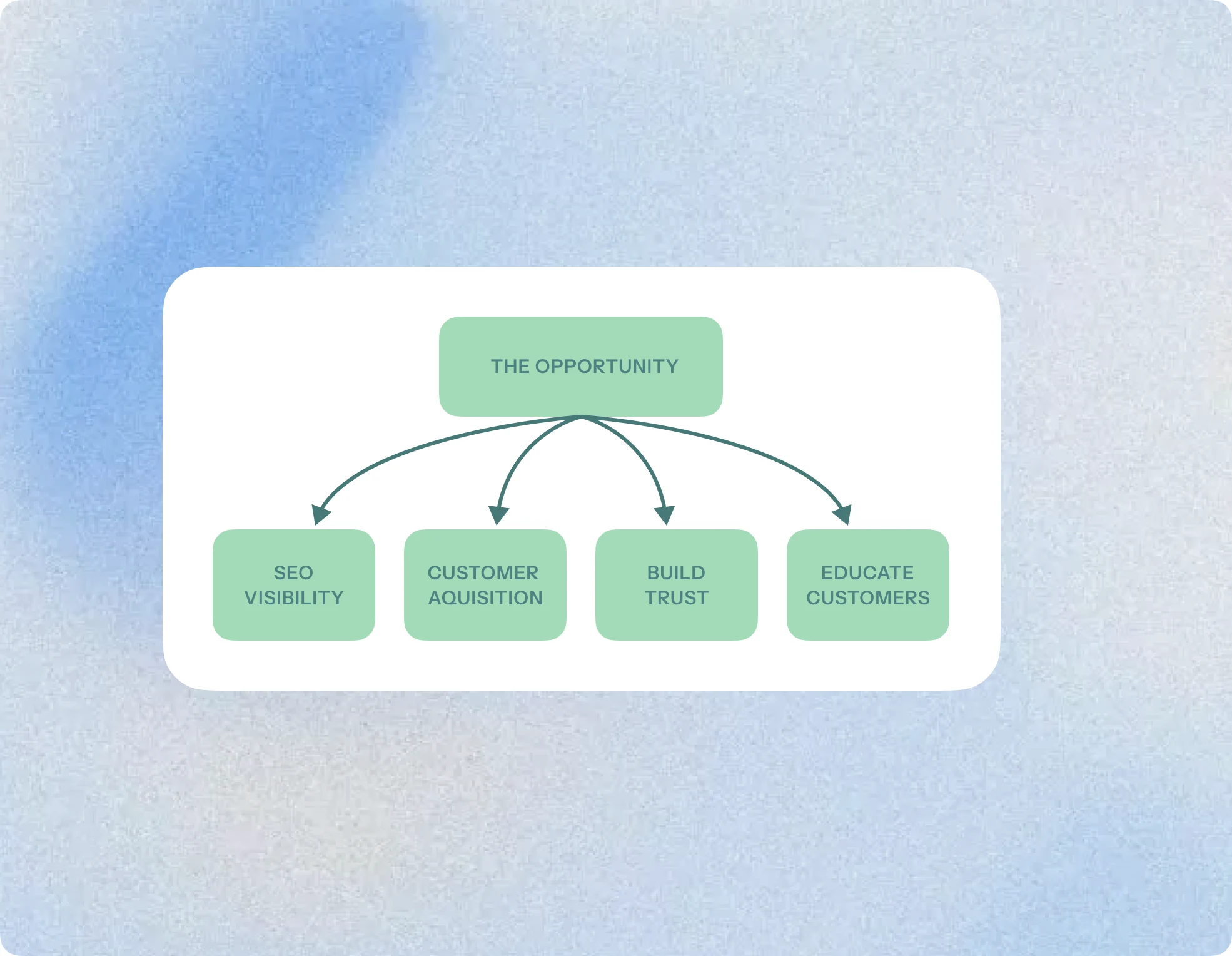
This calculator created an opportunity for users to learn about and explore coverage options at their own pace, even before booking a call with an advisor.
The starting point
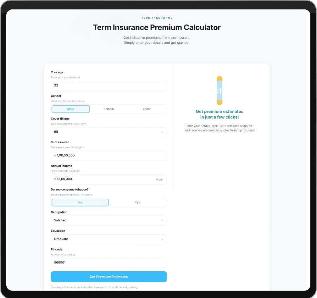
The Product Manager shared an AI-generated UI concept as an initial direction for the calculator experience.
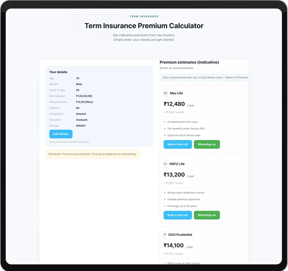
The AI-generated design helped kickstart the direction, but the experience lacked strong UI and UX fundamentals. As I explored the screens further, several issues around clarity, hierarchy, readability, and usability became visible.
Length of input fields
The vertically stacked input fields increased the overall card height, creating unnecessary scrolling and making the experience feel heavier than needed.
Since users also had to manually enter multiple inputs, the flow demanded more effort and adding friction to the overall experience.
The dropdown used for “Coverage Till Age” was not ideal for the large number of options available. This made selection slower and less intuitive, affecting the overall usability of the form.
The “Sum Assured and Annual income” text field required users to manually enter large values, increasing effort and making the input process less convenient.
Inefficient Layout
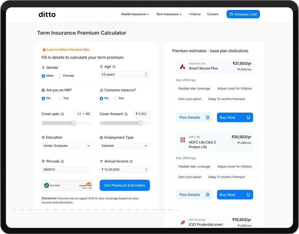
The plan suggestions and user inputs were placed within the same layout, making it harder for users to clearly associate and compare plans.
If users wanted to edit their inputs after viewing the plans, they had to scroll back up again, creating unnecessary friction and affecting the overall experience.
My Approach
Initially, I tried improving the existing AI-generated layout by making inputs easier to fill using sliders, dropdowns, and interactive controls.
But while exploring the experience further, I realized the problem was deeper than just input usability the overall structure, hierarchy, and flow itself needed rethinking.
Sorted out the layout
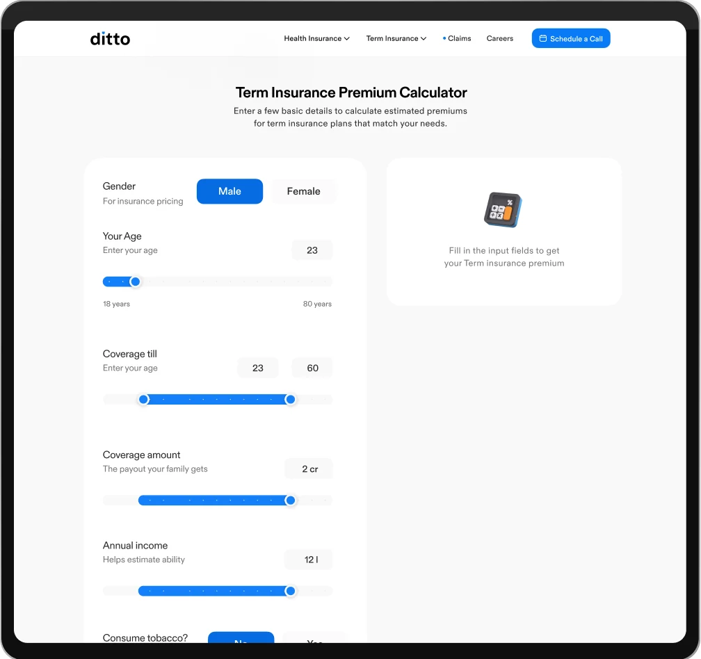
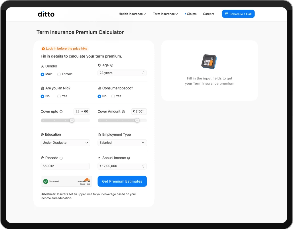
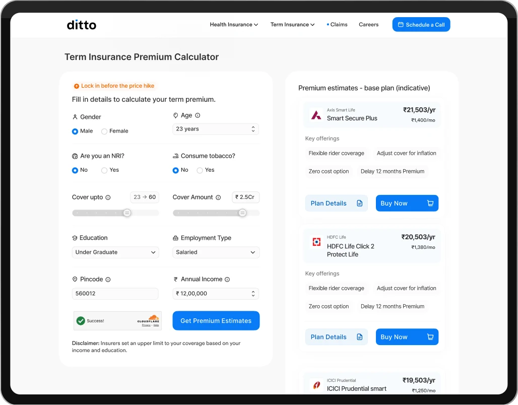
I separated the input flow from the plan recommendations instead of placing both within the same layout. I also introduced contextual placeholders that gave users a clearer sense of what to expect while entering their details.
Improving the structure
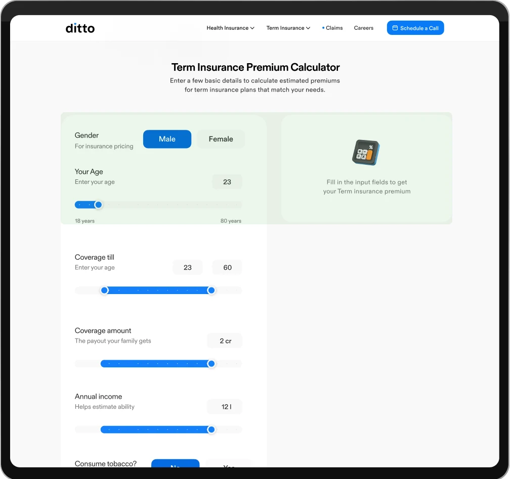
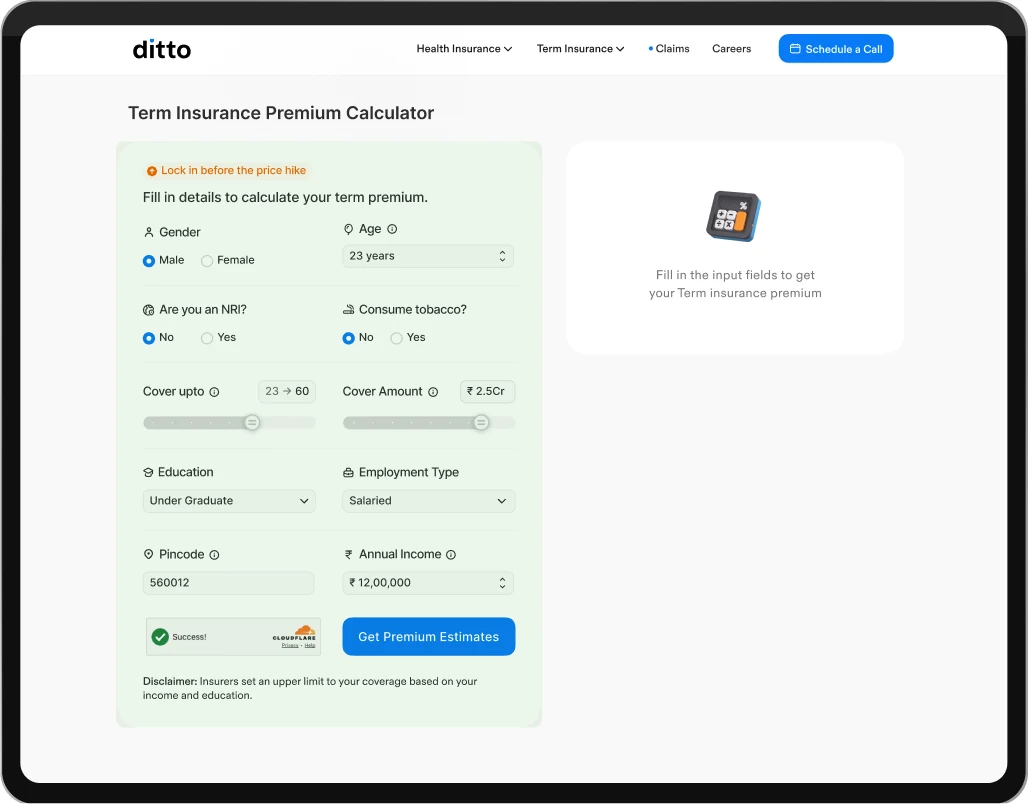
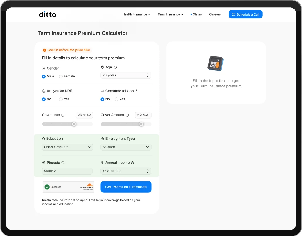
I realized the input experience was starting to feel like a long financial form. To reduce that friction, I redesigned the layout to fit the key input fields within the first fold, allowing users to complete the flow without unnecessary scrolling.
Input fields’ layout
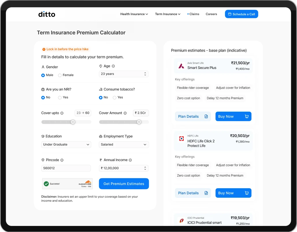
Simplified the input layout to reduce the feeling of filling out a long financial form. The key fields were reorganized within the initial viewport, helping users complete the flow faster with minimal scrolling.
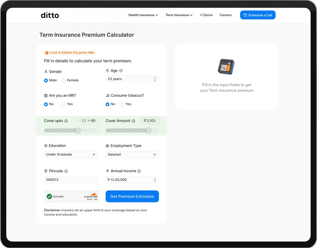
Using radio buttons for binary options reducing complexity.
Sliders for cover amount and coverage duration reduced the effort of manually entering large values.
Dropdown and steppers were used for the remaining fields to simplify selection.
Conversion trigger
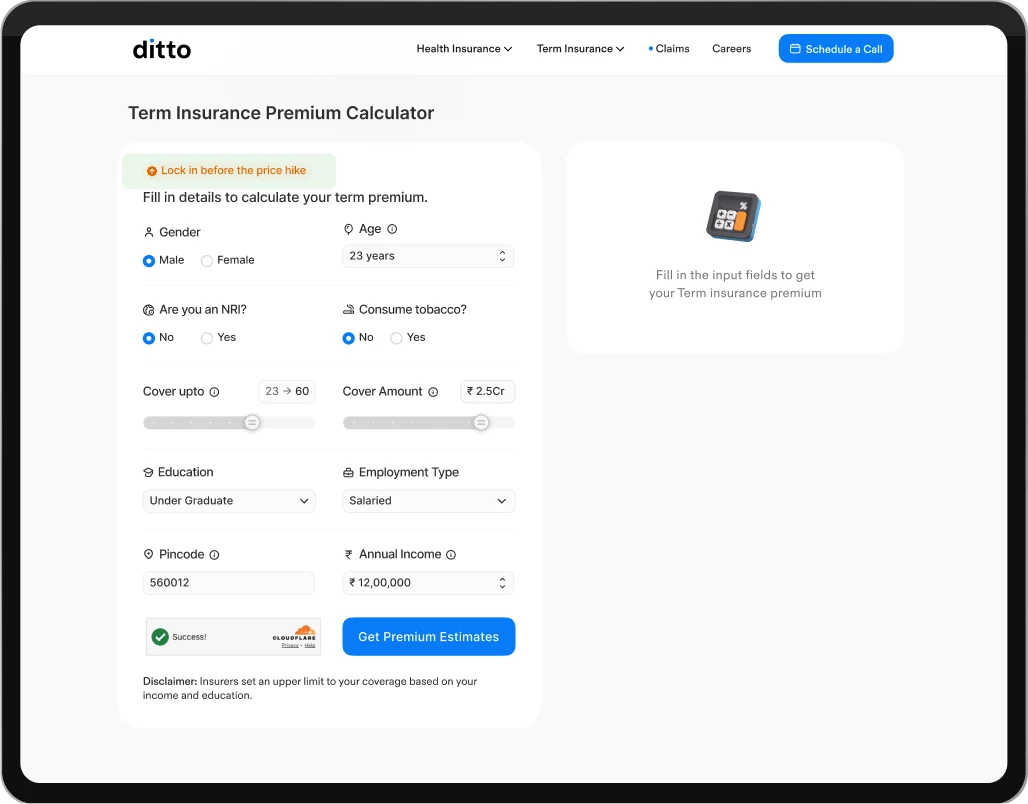
Added a conversion trigger to create a sense of urgency and encourage users to take action before the premium price increases.
System feedback
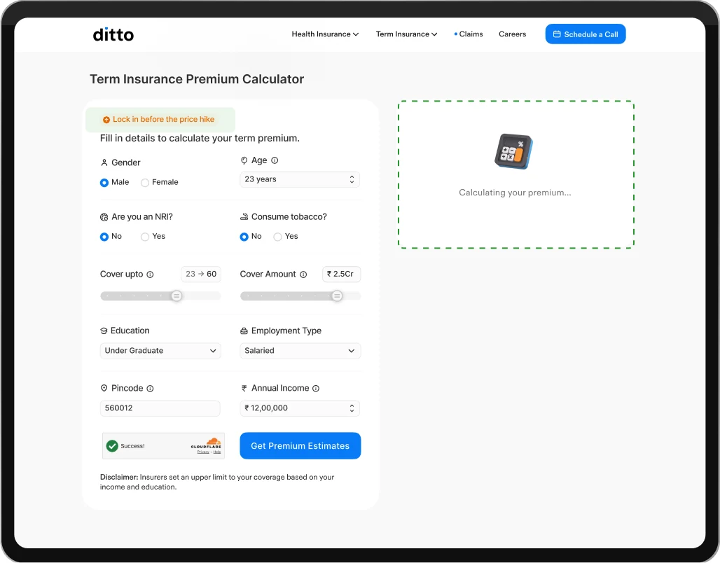
An animated calculator illustration provides system feedback, making the premium calculation feel active and real-time.
Plan estimates
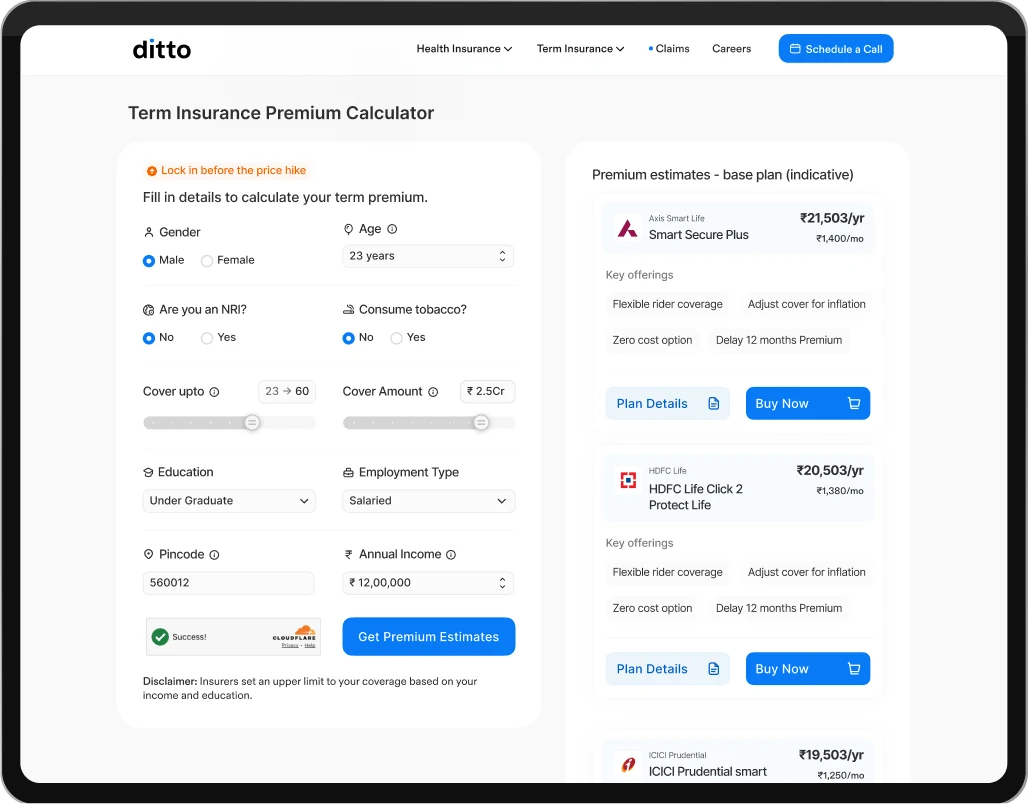
The plan estimates were redesigned to improve scanability and make plan comparison easier through clearer hierarchy, pricing visibility, and structured benefit highlights.
Key offerings were shortened into pill-based highlights to improve scanability and help users quickly consume plan benefits without reading long paragraphs..
Expected outcomes
The experience was designed to simplify coverage exploration, improve financial understanding, and help users make more informed decisions before booking a call.
From a business perspective, it also aimed to support trust-building, customer acquisition, engagement, and SEO visibility.
Mobile version - V1
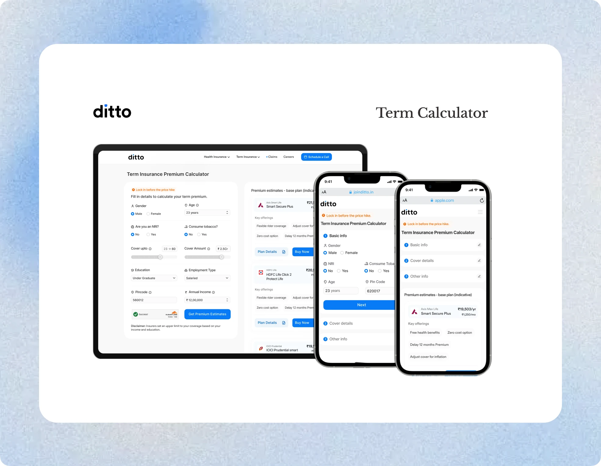
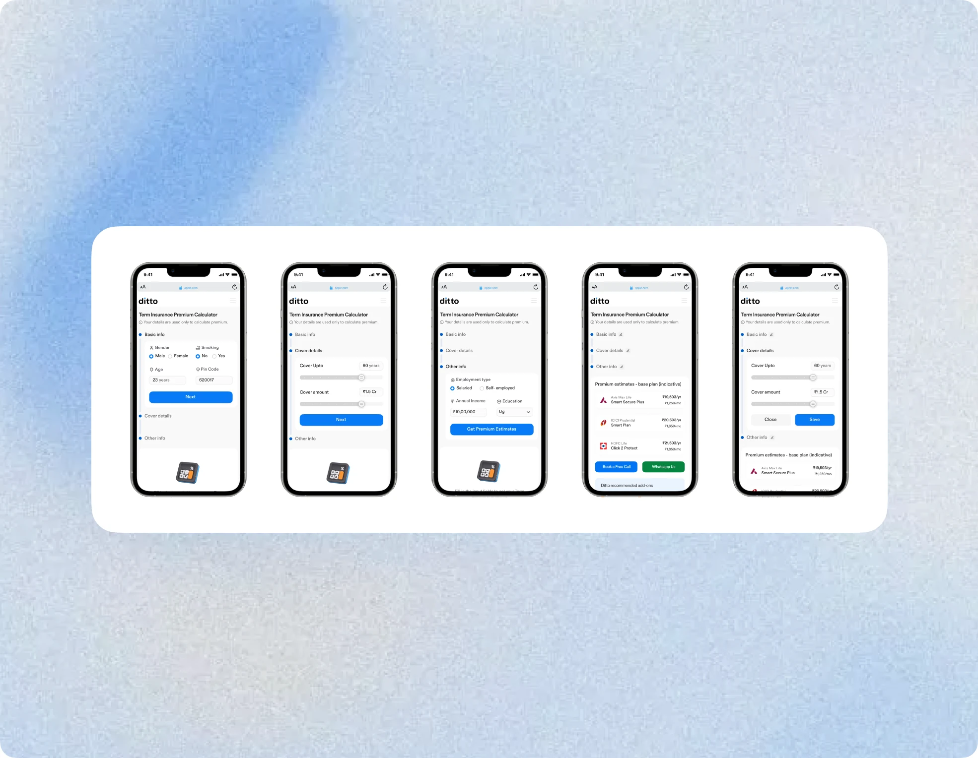
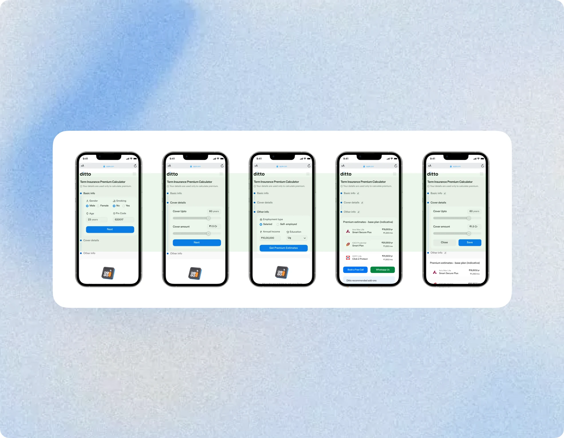
The two-card layout worked effectively on desktop, but adapting it for mobile required rethinking the structure due to limited screen space. Since most users were on mobile, optimizing the experience became a key priority.
Breaking down for mobile
To reduce scrolling and make the experience feel lighter on mobile, the inputs were divided into smaller grouped steps instead of presenting everything at once. This created a more guided flow while reducing the effort required from users.
The structure also helped users view plan estimates and input progress within the first fold itself, making the experience feel more connected and easier to navigate.
Mobile - Final version
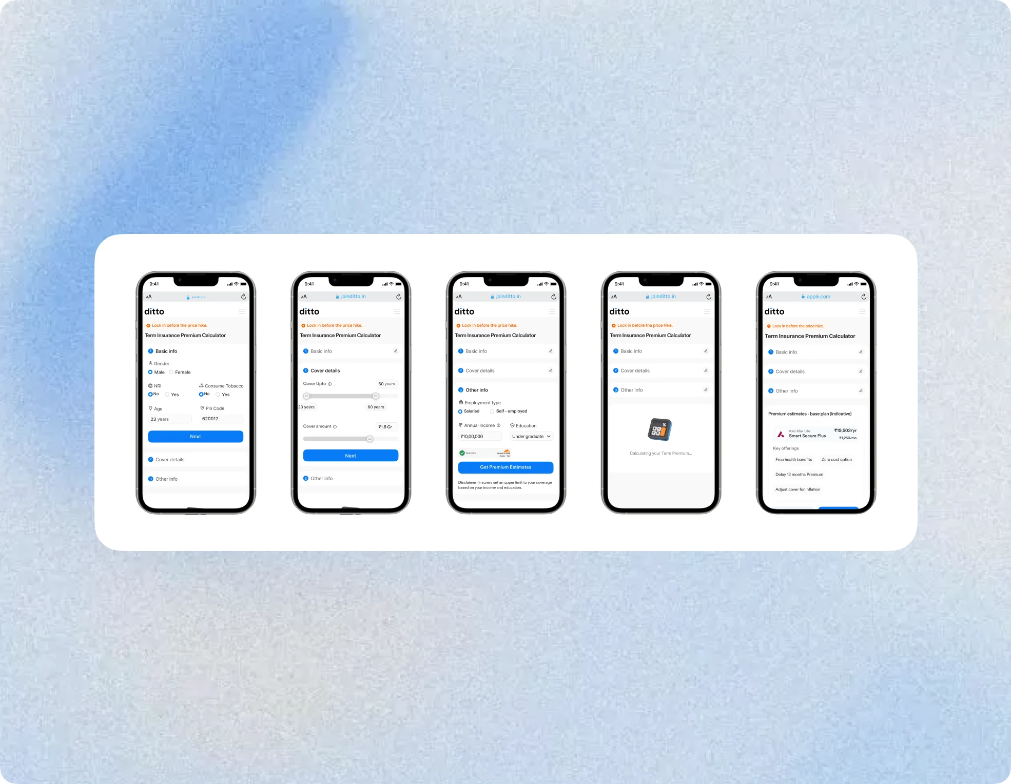
The layout was refined to give the cards more width, improving readability and creating better visual balance. This also helped the content feel clearer, more spacious, and easier to consume across the experience.